Building Home: a new activation layer for a trading app
How a new section gave new users a reason to stay, and the team a platform to keep learning.

About Doto
Doto is an international trading platform available on mobile and web. Users trade currency pairs, stocks, and commodities. The product attracts a wide mix of users: from experienced traders to complete beginners.
Main markets: South Africa, Vietnam, LATAM, MENA.
Platforms: iOS, Android, web.


The problem
New users landed straight inside the trading terminal: a dense interface built for people who already knew how to trade. There was no onboarding, no orientation, no clear next step.
Most of them never made it to a first deposit. Both paid and organic traffic dropped off early, often within the first session: users opened the app, tapped between tabs trying to figure out what they were looking at, and left.
First-deposit conversion was a known business problem; one that several teams had been working on for a while, from different angles.
Before Home: what had already been tried
The work was scattered and parallel. A few examples of what had been tested:
- Two product tours. My team (Growth) tested a post-registration fork with multi-step tour variations inside the terminal. Most users stayed in demo, engagement dropped after step two, deposit didn't move.
- A deposit bonus. Up to +50% in matched bonus funds, with banners on Accounts and Deposit pushing the offer. It didn't meaningfully move conversion, and the users it did attract tended to lose money quickly and never return.
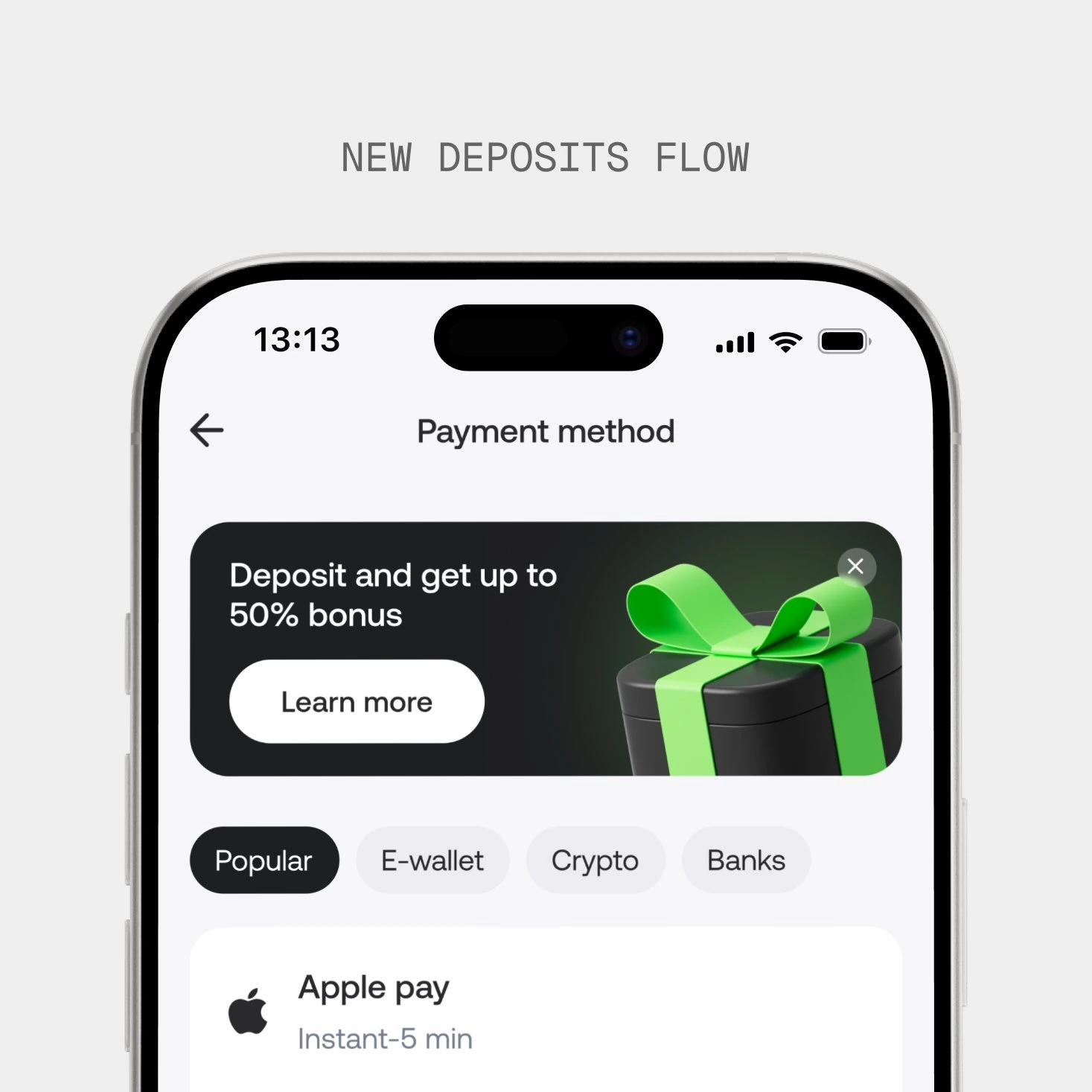
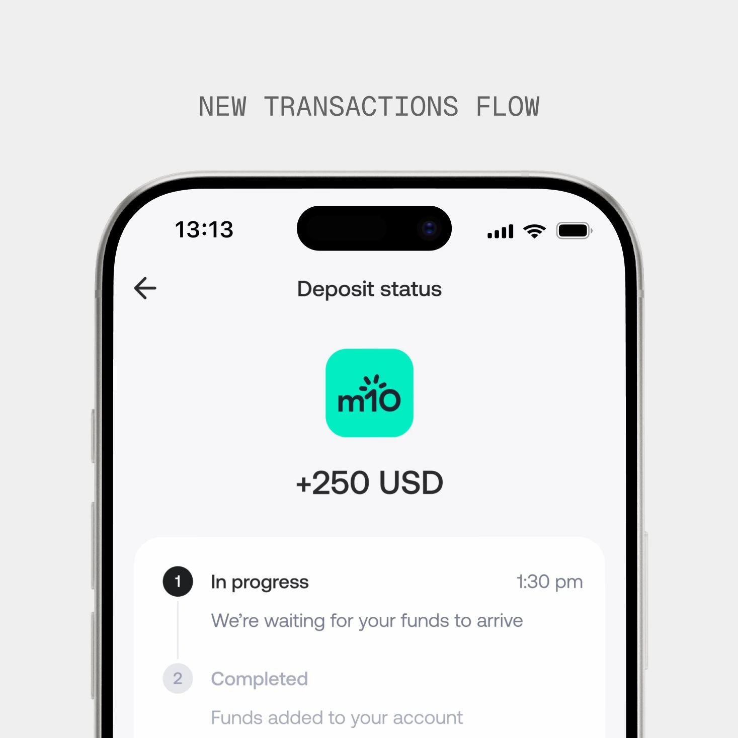
- A redesigned deposit flow. Simplified screens, new payment methods per geo, and a clear post-transaction status screen that cut related support tickets. Helped at the margins, but didn't change the overall picture.
- The team had tested landing new users on different existing screens: Accounts, Watchlist, the Terminal itself. None worked as a starting point.
The same pattern kept showing up: every intervention was layered on top of the existing structure. None of it changed the moment that was actually breaking the experience: a new user landing inside a trading terminal and not knowing what they were looking at.
Reframing the problem
The pattern across these attempts pointed to something: the product was missing a layer. A place to land users before the rest of the product: a section that could support onboarding, orientation, education, account setup, and discovery.
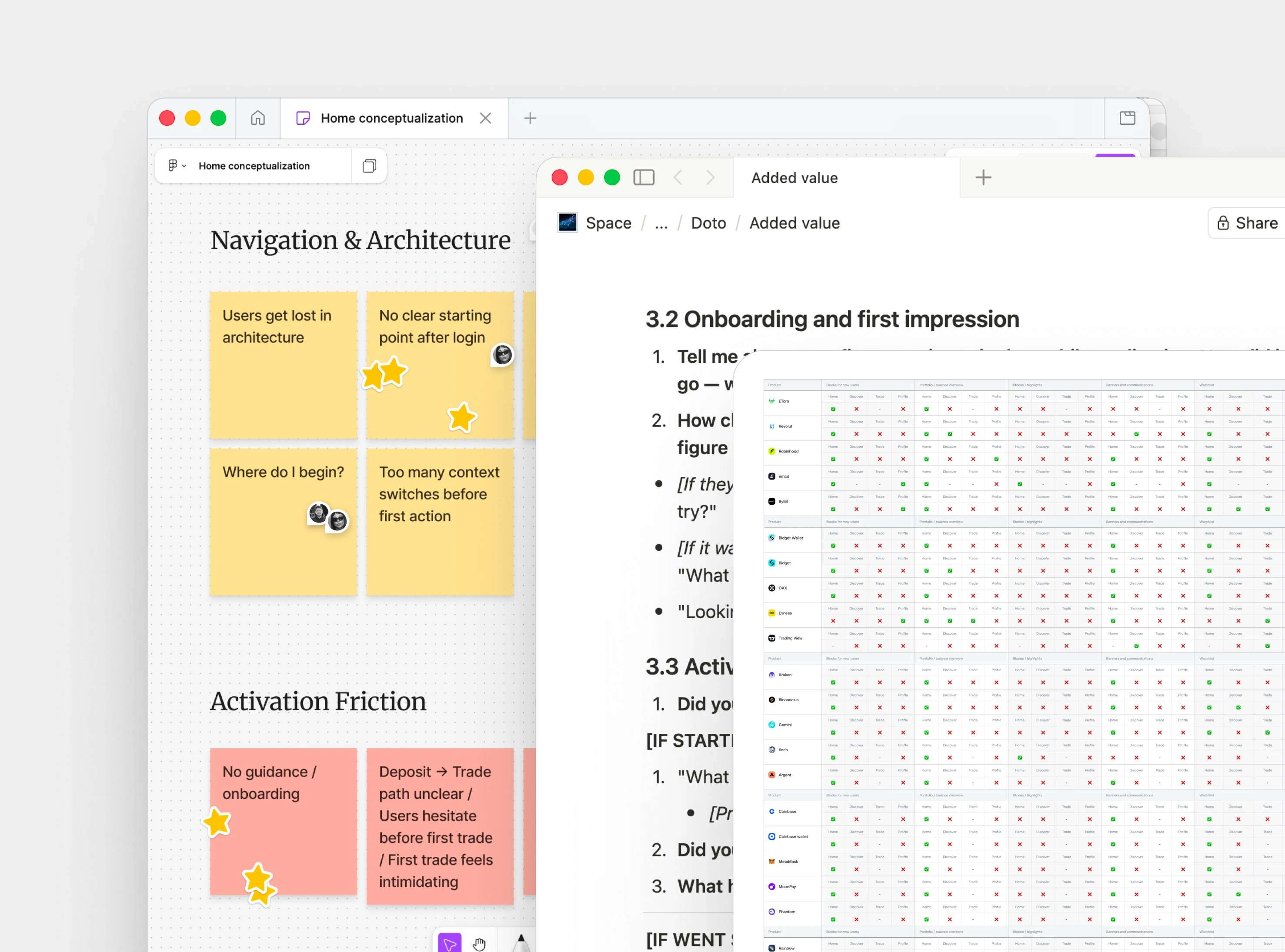
To shape this layer, I conducted research: made a competitor analysis, reviewed the funnel and drop-offs provided by the PM, and conducted user interviews. Throughout the research process, we were constantly aligning with C-level stakeholders and the rest of the team, translating workshops, brainstorms, and research insights into tested product hypotheses and activation-to-retention modules.
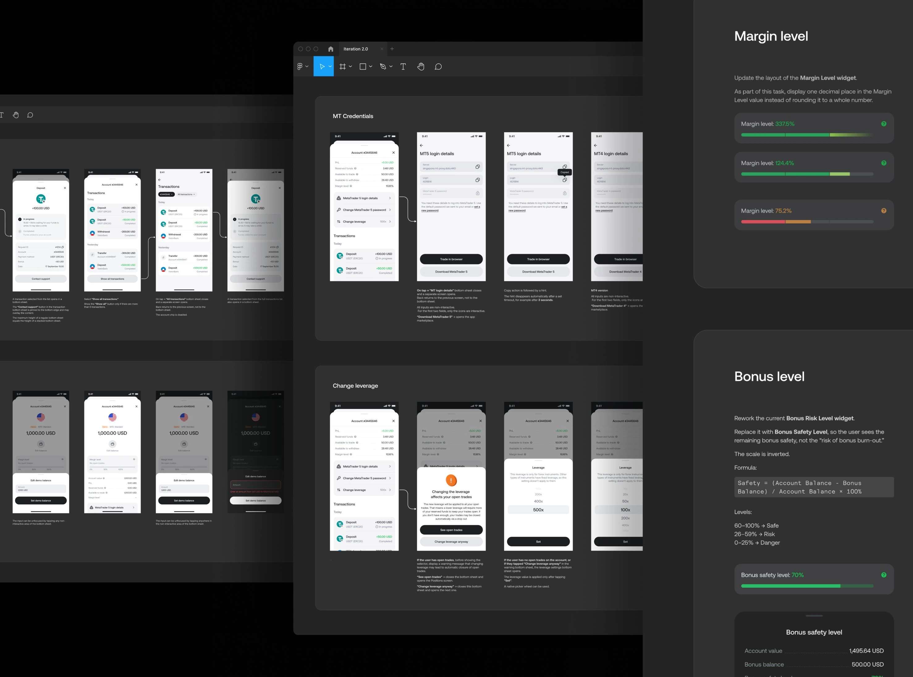
Shipping it across 11 releases
Building Home wasn't just adding a new screen, it was a structural change that touched app navigation, account management, and guidance patterns across the product.
We shipped it incrementally across 11 releases, starting with frontend changes and moving into more comprehensive backend-driven features.
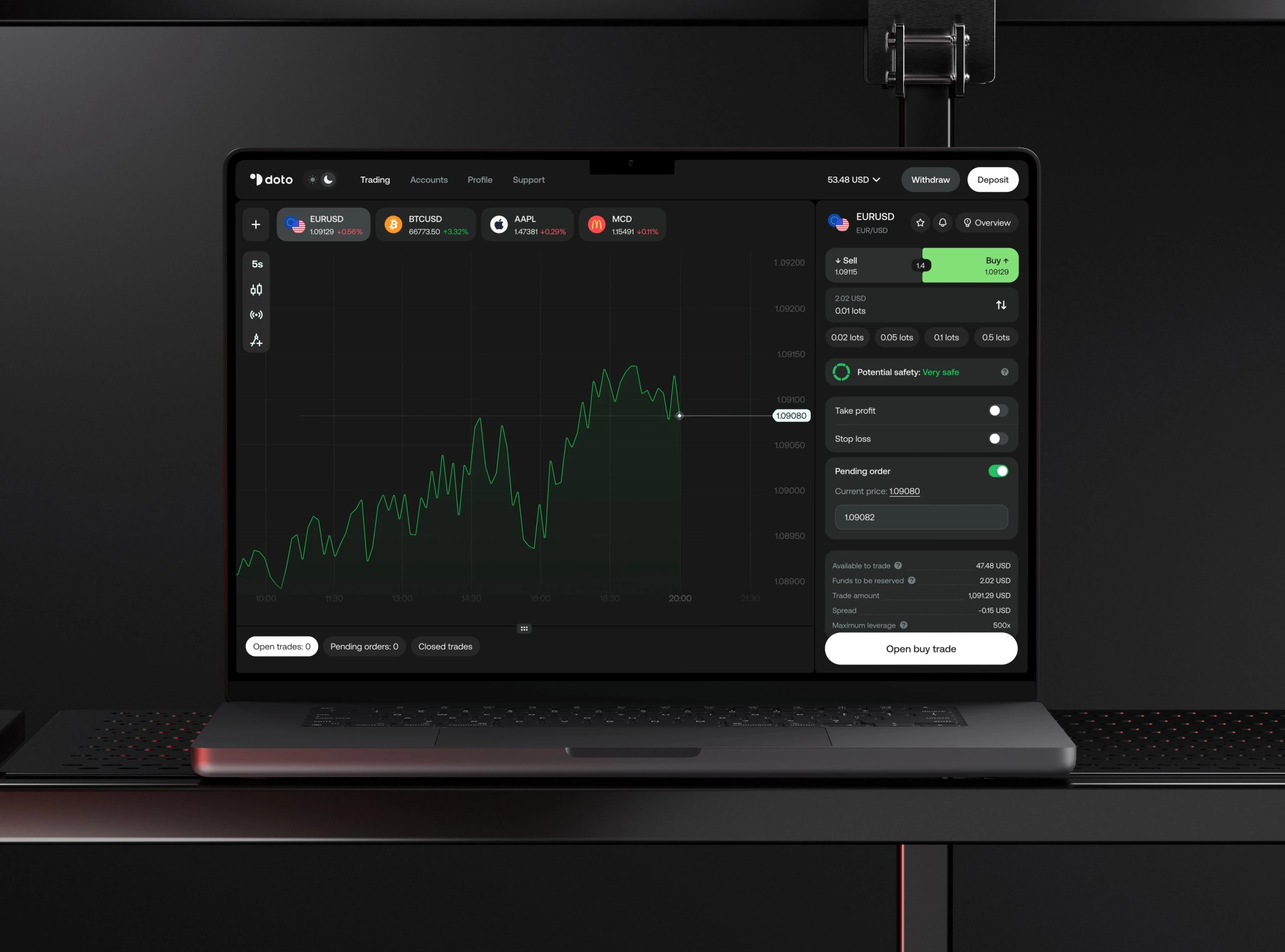
Home
The old navigation organized the entire app around execution. Trading was the primary tab, but Watchlist, Positions, and Accounts all assumed the same mental model: you're here to trade, here are the tools. That worked for users who already knew what they were doing, and against everyone else.
Home was designed as a different kind of starting point. The product's center of gravity shifted from execution to orientation, without losing access for users who came to trade.
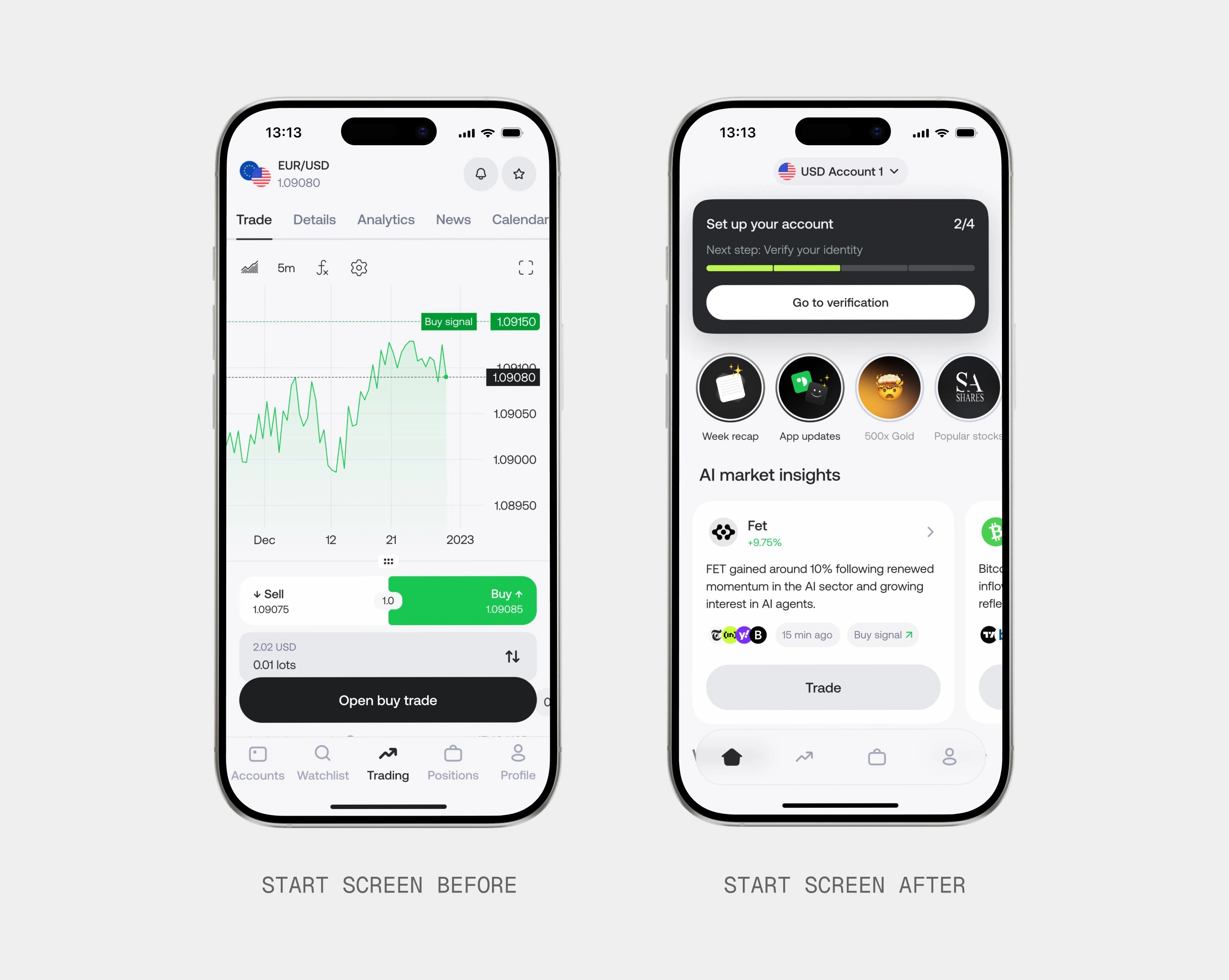
Onboarding
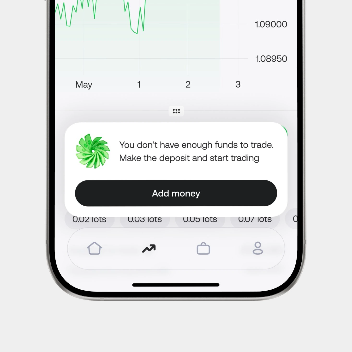
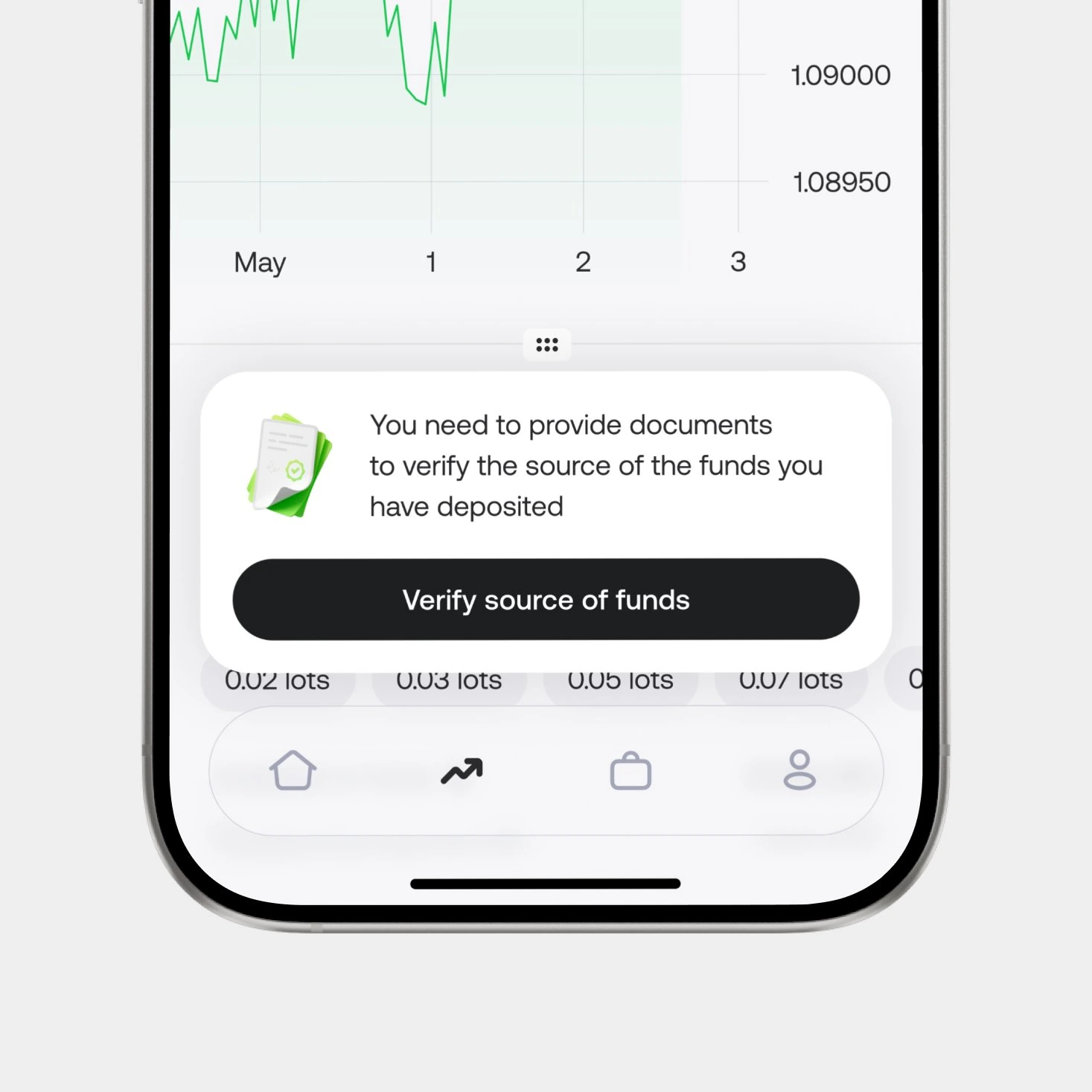
Account setup at Doto involved real-world dependencies: identity verification, source-of-funds checks, deposit methods that varied by geo. Any of these could stall, and when they did, users had no way to see why or what to do next.
The onboarding widget on Home made that path visible: where the user is, what the next required action is, and what's blocking them when something gets stuck.
Guidance also followed users into the trading flow, surfacing the right next step in the moments where blockers actually appeared.
Account management
Account management was redesigned around one decision: show one active account at a time.
The old Accounts screen did three jobs at once: listing every real, demo, and archived account, surfacing detailed financial metrics, and offering multiple actions.
On Home, those three jobs were split into three surfaces. The active account sits at the top with three primary actions: Deposit, Withdraw, Manage. Switching accounts moved into a dropdown at the top of the screen. Detailed metrics moved into Manage, available when needed but no longer competing with the primary actions.
AI Market Insights
User research had already surfaced a clear signal: users didn't want a "magic make money" button. They wanted to understand why an action might make sense.
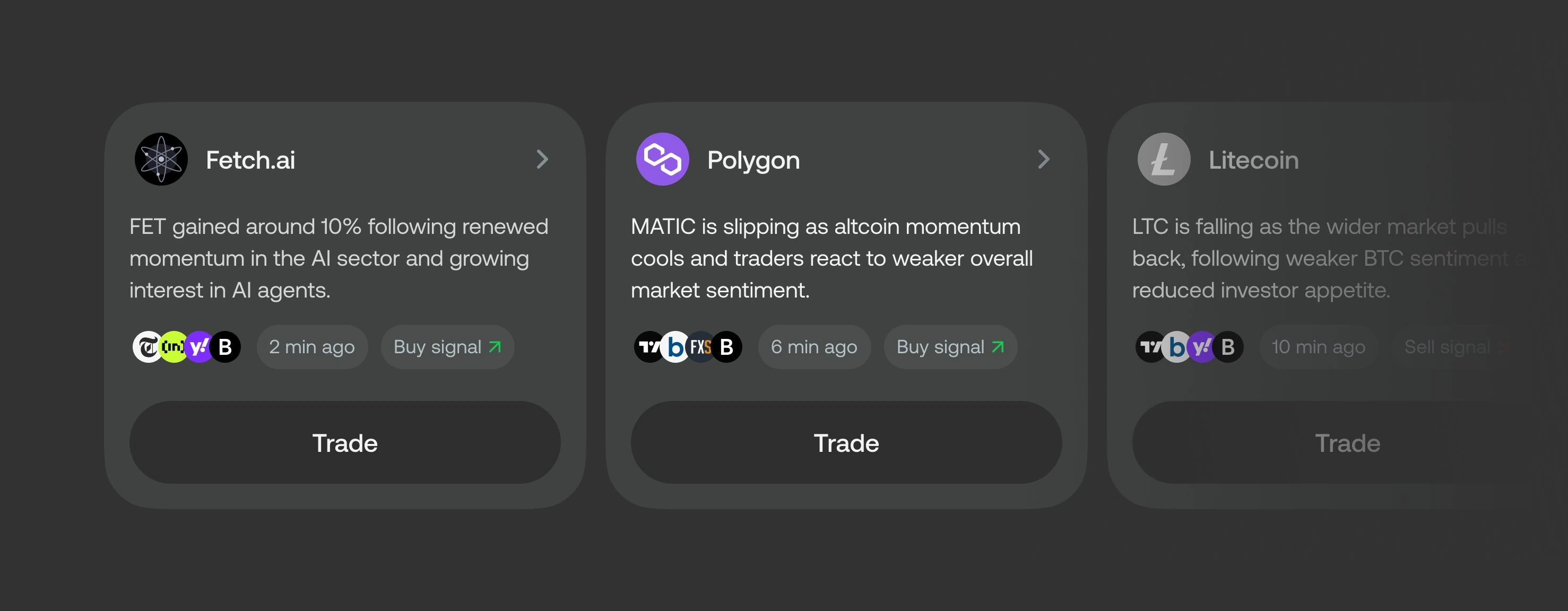
Combined with another finding (that breaking news was often what pushed users to trade in the first place) the opportunity took shape: structured, explainable insights tied to the news driving user decisions.
Working with a PM, engineer, and trading specialist, we designed AI Market Insights, a card-based widget that combines news from verified sources with trading signals from our market data provider, then uses an LLM to turn the combination into a short, structured explanation: what happened → why it matters → what to do next.
Home as platform
Beyond onboarding and account management, Home was designed to host a set of lightweight, modular blocks: places where the team could try things, learn fast, and swap what didn't work.
Stories. Integrated via Storily, a third-party tool with built-in interactions like polls and voting. Stories gave the team a flexible channel for promos, product updates, and segment-specific education.
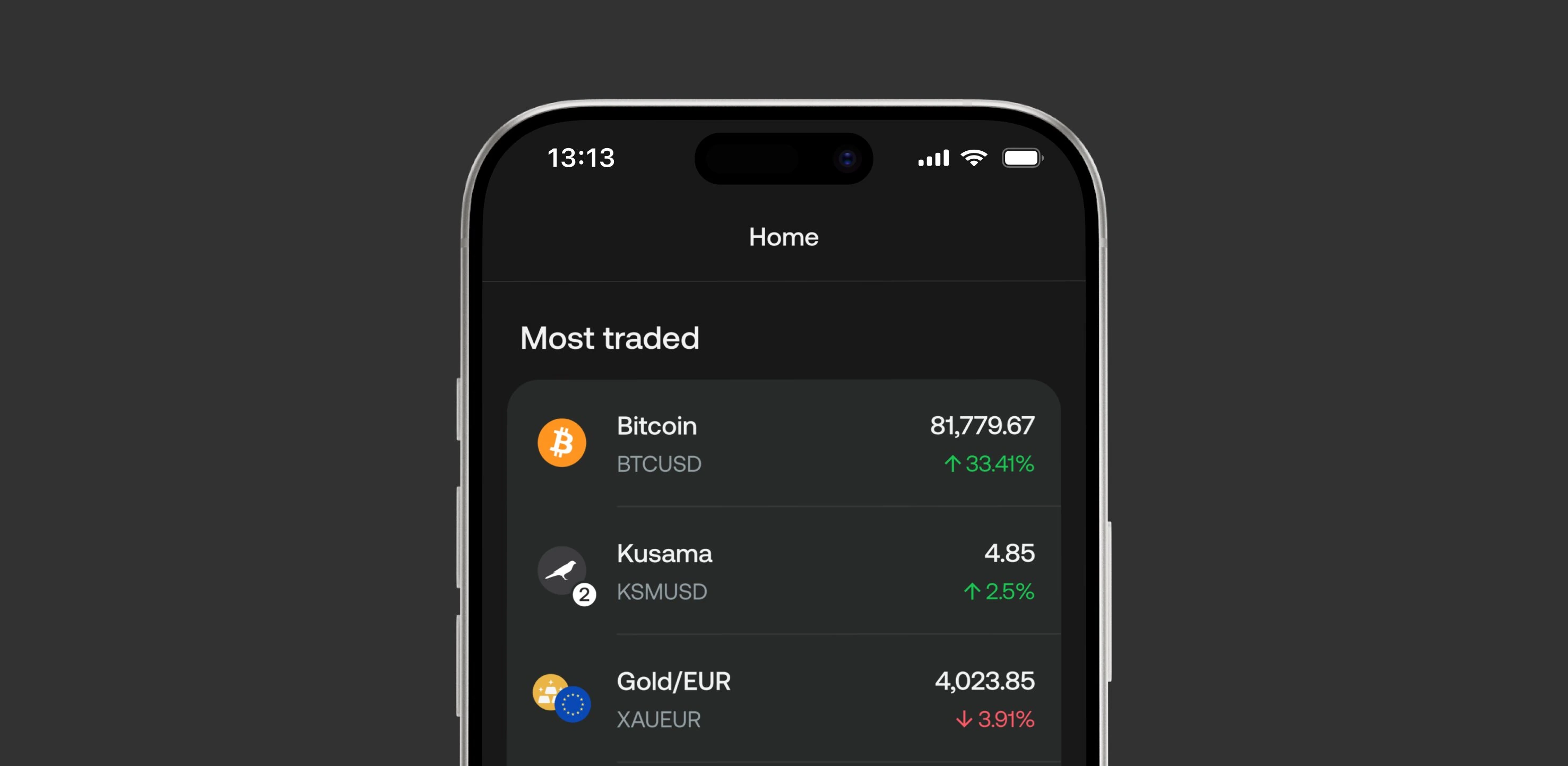
Asset discovery. A modular block for surfacing trading opportunities, tested in variants: Top Movers (by price change), Popular (by user interest), and Most Traded (by volume). The variants could be reordered or A/B tested, letting the team learn which logic actually helped users find trades.
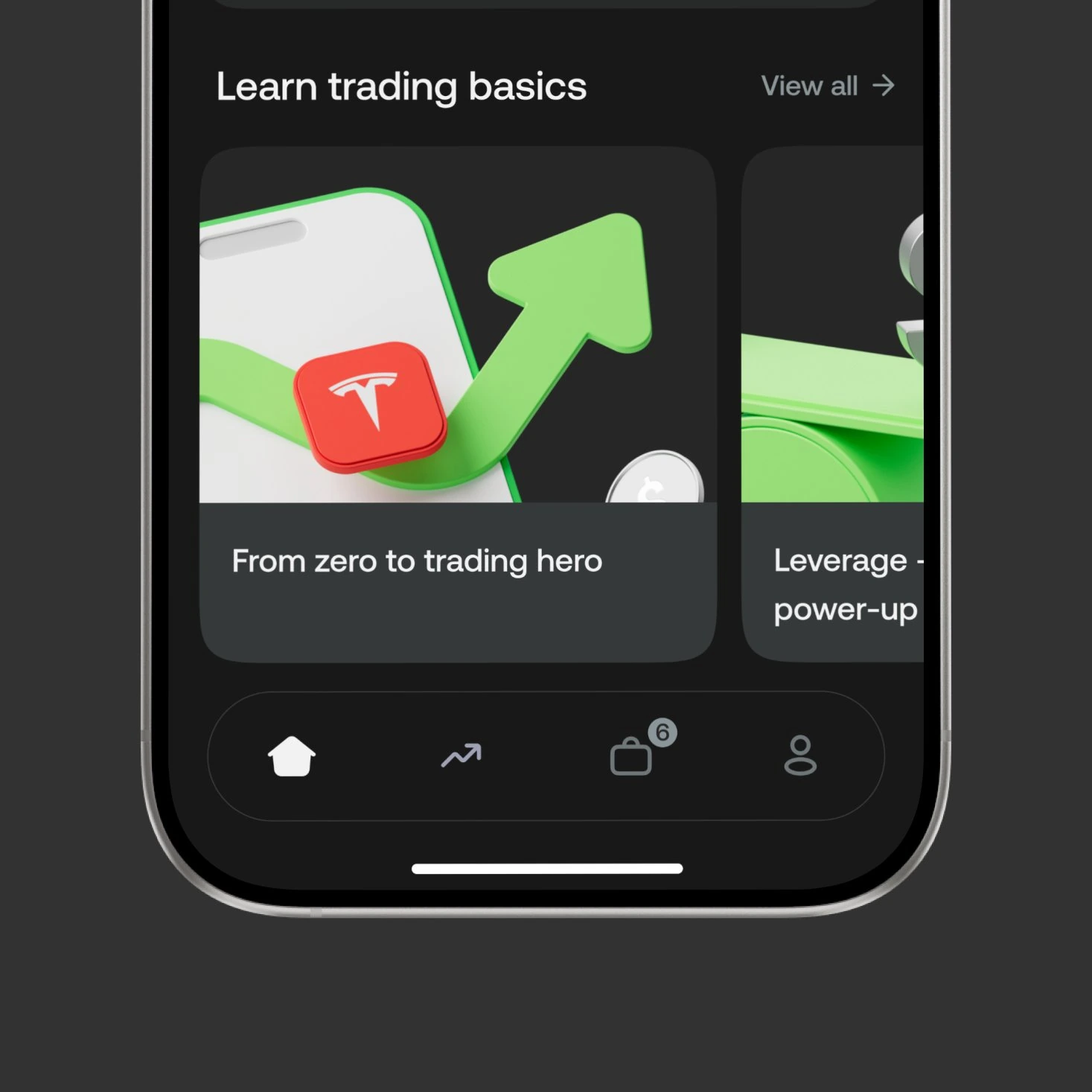
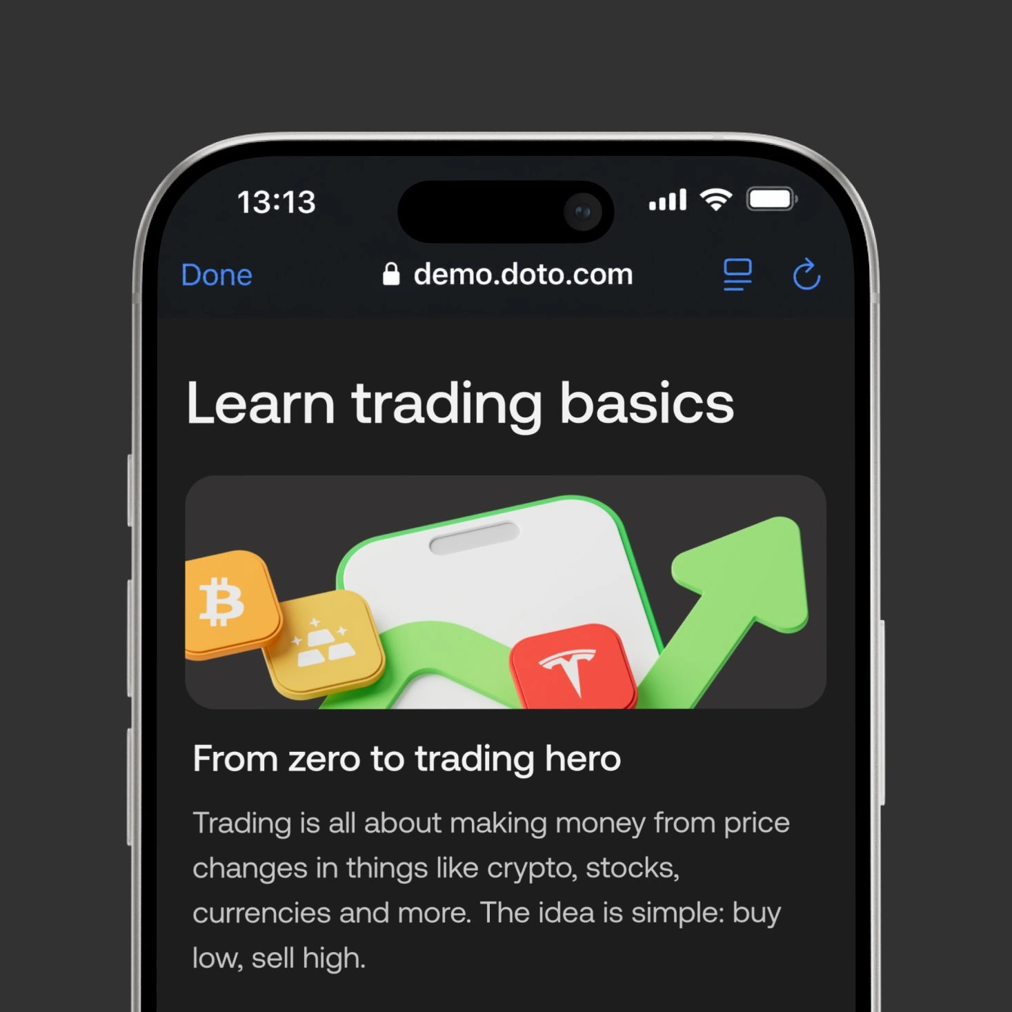
Learn. A surface for short-form educational content tied to specific trading actions, with reach and engagement tracked per topic to learn which areas users actually wanted to understand better.
Each module was independently testable, replaceable, and measurable. Home stopped being a screen and started being a layer the team could keep building on.
Outcome that compounds
Home wasn't just a new section — it was a layer the team could keep building on. Each module on Home was independently testable and replaceable, which meant the product could keep learning about new users without touching the trading experience underneath. Activation hypotheses that used to require structural rework now shipped as new blocks on Home.
AI Insights was the clearest example of this. After it shipped, user feedback pointed us toward extending it beyond entry — surfacing context after a trade was opened, not just before. That work is ongoing. Home made it possible.
+50%
30-day retention+7%
First deposit conversion3x
Faster activation tests